 The Broadband Outreach Center began collecting residential broadband coverage maps from providers over six years ago.
Since that time, the Center has mapped wireline, wireless, and mobile broadband services in Utah updating the statewide maps at 6 month intervals. The mapping initiative has relied on the generous, apartnership of Utah’s 60+ commercial broadband providers that have voluntarily submitted their coverage and speed data.
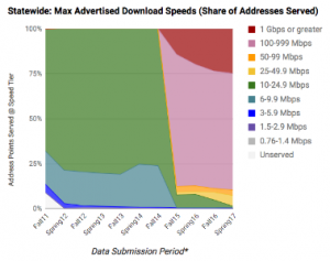
This month, we’ve analyzed the broadband map data, going all the way back to back to Fall 2011, to create 1 statewide and 29 county graphs that show the percent of addresses served by each download speed tier (maximum advertised speeds).
To generate these graphs, we’ve taken the 1.16 million addressed locations in Utah, as sourced from county mapping offices, and we’ve assigned the highest speed available from the map data for each submission period. Although actual coverage speeds have been reported by providers since Fall of 2015, we’ve formatted the graphs to use the NTIA ‘speed tier’ approach, to present the data in a consistent format.
Think of these graphs as showing trends in the reported broadband service information over time. As an example, look at the very left side of the statewide graph above that shows Fall of 2011. The green area depicts the 68% of addresses were served at 10-25 megabits per second (Mbps) which was then the fastest available download speed tier for residential customers at that time. Moving through time from left to right, faster service (warm colors) gradually become available and increase their share. And, in Spring 2017, the right side of the graph, 89% of residential locations were served at 100+ Mbps (pink and red).
In general, the graphs, with county by county detail, tell the story of the steady progress made by providers to enhance Utah broadband capabilities that, ultimately, contribute to successes in economic development as wells as health, safety, and educational outcomes, just to name a few.