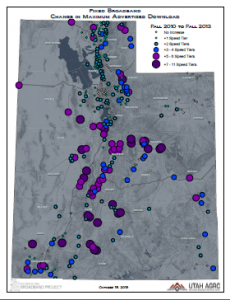
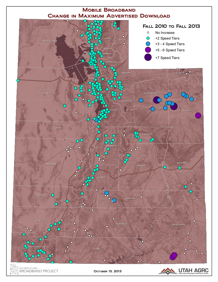
This month the Project’s mapping team compared how advertised broadband speeds have changed since the beginning of the Utah Broadband Project. The comparison goes from Fall 2010 – Fall 2013. Fall 2010 was the first data collection round in which all of the known broadband providers participated with the mapping arm of the Project by providing their service areas and associated speeds and technologies. The most recently collected provider data is for Fall 2013 and is ready and waiting to be submitted to the NTIA and FCC when they re-open for business.
While the detailed GIS-based broadband data collected by the Project is available down to the block level, we’ve chosen to aggregate the data to the 326 cities, towns, and populated places used by the Census Bureau. This makes the differences in reported broadband capacity easier to visualize quickly, accommodates for minor differences that may by due the precision of the data reported (which keeps getting better every submission), and it allows us to better assign population numbers to the changes.
To map the change in speeds, the maps shows how much a place’s broadband download speeds have increased by in the last three years. The bigger the circles, the more that place’s speeds have increased since 2010.
 The first map (blue-grey map background) shows the increase in the reported fixed broadband download speeds by the change in the number of NTIA speed tier intervals. This map is relevant to site-specific broadband use via fixed wireless, cable, DSL, and fiber optic connections.
The second map (brick red map background) shows the amount of increase in the reported mobile broadband download speeds by the change in the number of NTIA speed tier intervals. This applies to service used by smartphones, aircards, and similar devices
There’s a bit more to this analysis than is shown on the maps. We’ve put these statistics and more into a Google Spreadsheet that also shows the number of providers, the maximum available download speed, and the differences in these indicators from fall 2010 to fall 2013. 2010 Census population is also listed for each community.